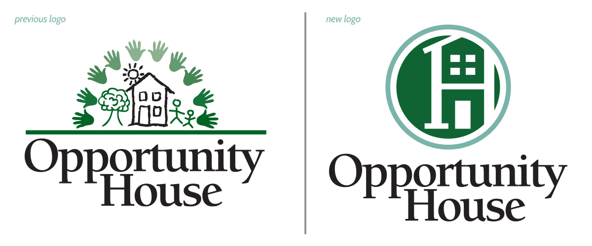
Last year we began a strategic planning process that changed the way we look at our organization, who we are and where we are going. We took time to look inside ourselves to answer the question: What is the big dream we share for our organization and for the people we serve in Berks County? We interviewed our key stakeholders to find out what we feel deeply passionate about regarding how we work and what can we can do with true excellence as a team. Interviews took place with our board of directors, leadership team, staff, customer base at OppShop, shelter clients, veterans, parents at our learning center, donors and our volunteers. We analyzed all this information to find common themes that were used to establish our new brand identity that is reflected in our purpose statement, our core values and our brand promise.  To complete our transformation we created a new logo to reflect our new identity. In the rebrand, we wanted the organization’s new logo to help push us into the modern era while still keeping its roots in the history and imagery that built us to this point. In Opportunity House’s previous logo, the focal point was a hand-drawn house with people, a tree, and sun imagery that spoke more towards our early days as an organization. In keeping the theme of the house imagery, a new mark was created using a circle to symbolize the ‘O’ for Opportunity and a house built from the letter ‘H’ for House. There is a purpose for the house’s door not having any kind of knob or window structure – because here at Opportunity House, our door is always open and we wanted to reflect that with our new branding; always open, always inviting, and always a safe place to go when our people are in need.
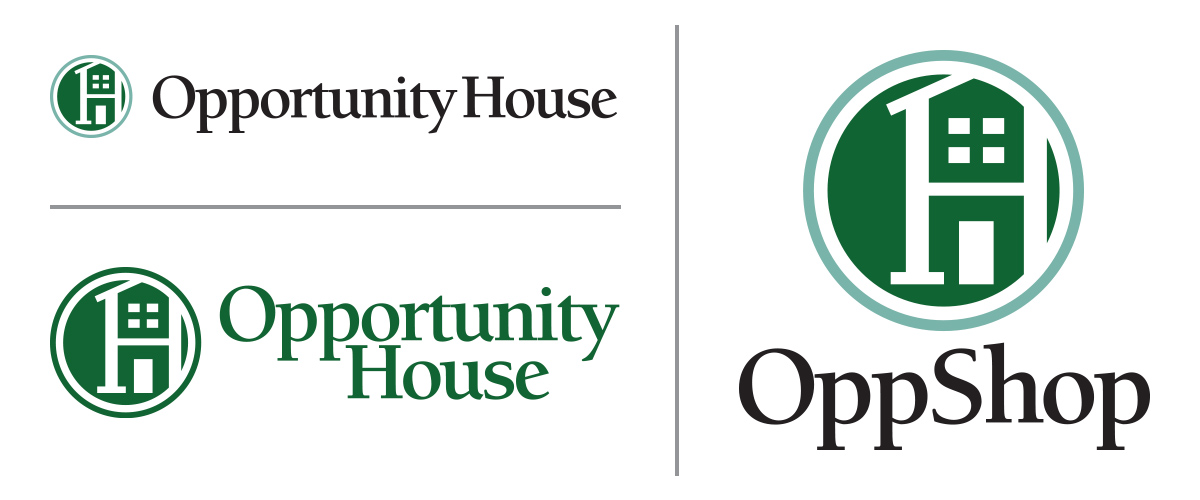
  With the house image knocked out of the circle it makes for a very simple, timeless and recognizable mark that can grow with us as we progress. A second circle was added around the mark to lock everything in and add a secondary color to help expand the brand’s presentation. The logo font from the previous logo was carried over to support the history of the organization. This new logo comes with multiple versions for multiple use cases and is much more usable at any size so it can be recognizable from a giant billboard to a tiny business card. Along with this new logo, additional creative assets were made to help reinforce this new branding and help give our organization a consistent look across all platforms.
  In addition to the new logo we have a new website with images taken mostly from around our campus by Photographer Bill Coughlin. We invite you to browse our new website, or visit our campus for a tour. At this time of new beginnings, we are excited to show off all that your support has helped us to achieve and we look forward to more good news to share in 2022!

New year, new look, new website!
SUCCESS STORY
Addiction Lead to Homelessness and Redemption–Opportunity House
“When is the bus stopping? I need a cigarette.” You’d expect to hear that from people who have an addiction to cigarettes. They don’t sound like life-saving words, but they were. When Terrance left Atlanta to return to Pennsylvania, he had no plans. His girlfriend died. Her children didn’t want him around. He was returning […]